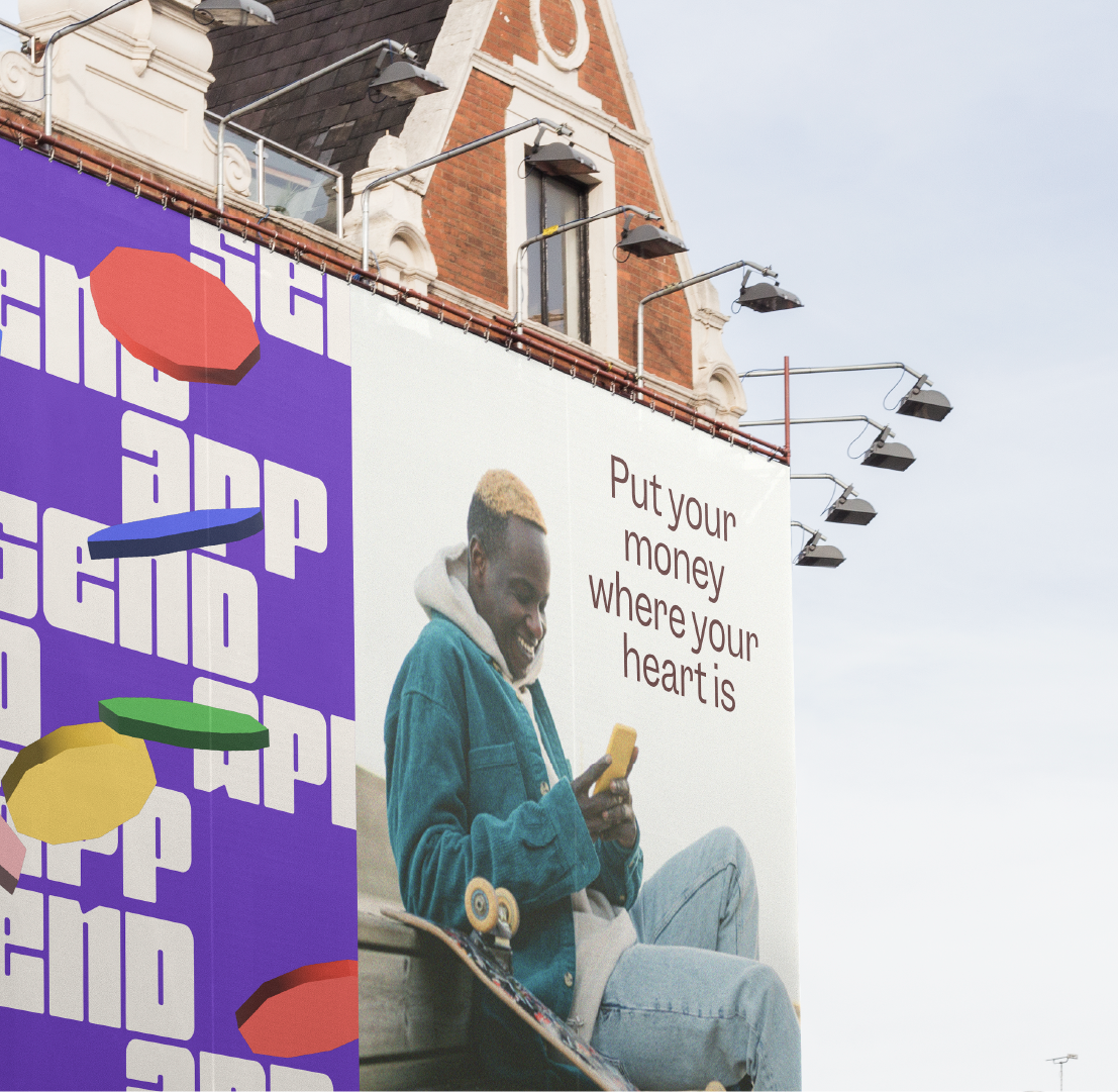
Send App
Put your money where your heart is
Where the US has Venmo, The Netherlands has Tikkie, Africa now has Send App. Verve helped captured their wholehearted take on money transferring in a fun, bright and human-centered identity. Highlighting their ambition to make money transfers something magical, rather than mechanical.
Positive change
With just one text message, Send App enables you to support family and friends in the most remote locations of the world. Yet, making a positive change doesn’t only apply to individual users. Looking at a global level, broad and inexpensive access to digital money and phone-based transactions could opens doors to financial services for 1.7 billion people without traditional bank accounts — making the real world impact significant.
Financially human
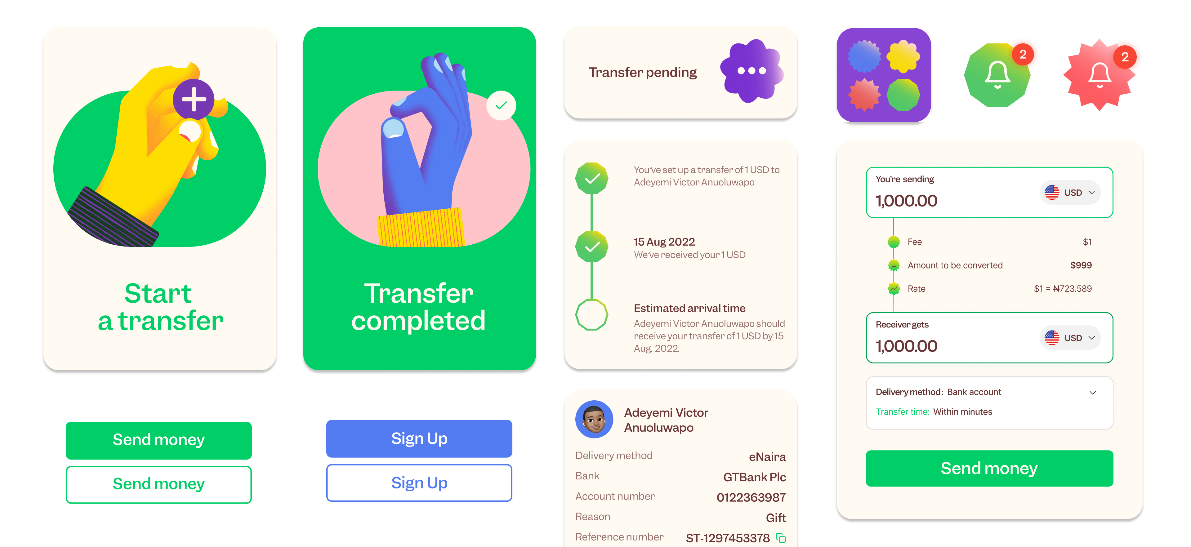
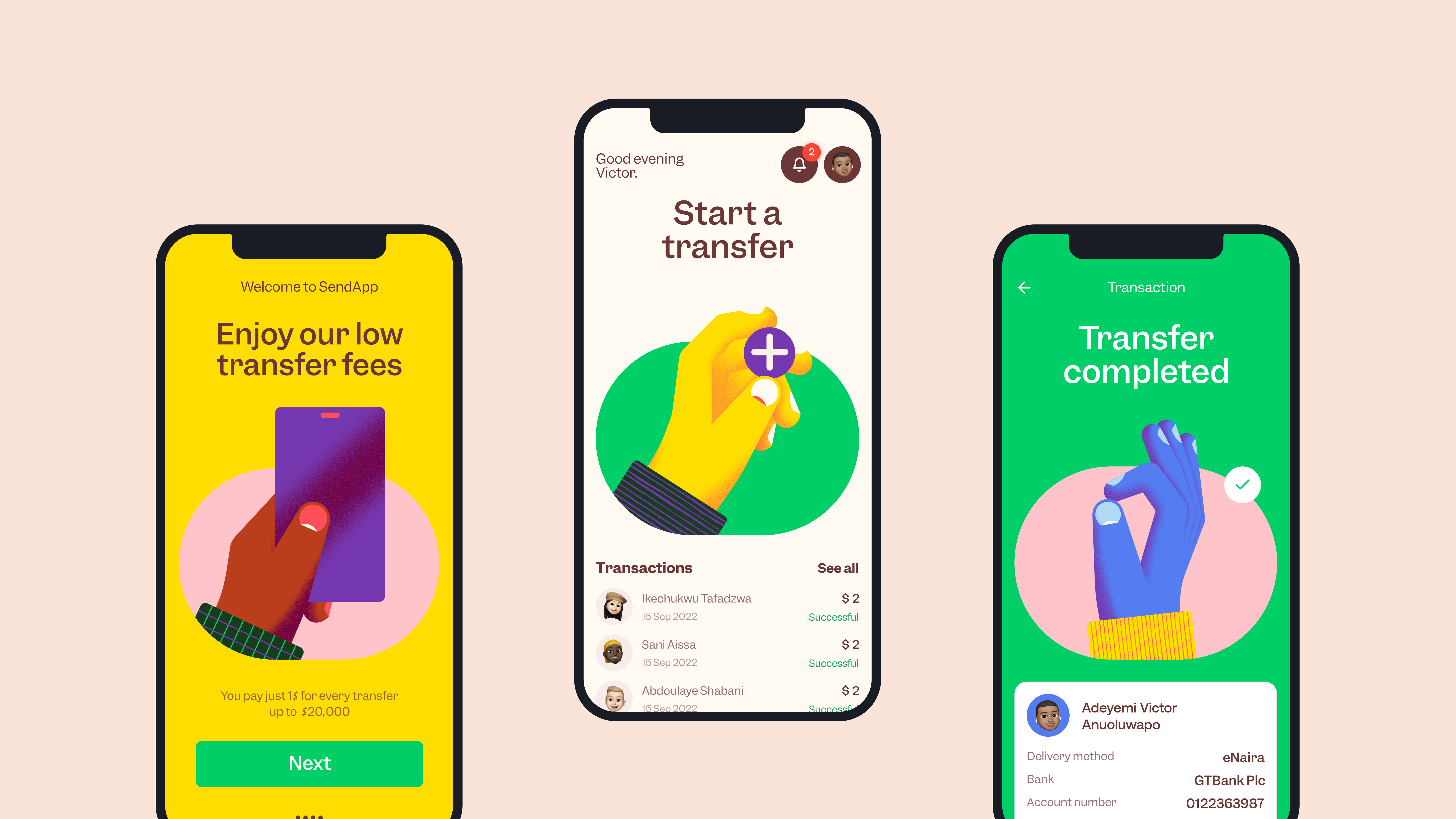
Send App knows what it's like to be away from home and loved ones. Whether it’s to make dreams come true or show that you’re thinking of someone: financial support is the way to go. We embraced the recognizability of the financial world that’s dominated by blue and green, and elaborated on this by adding vibrant colors like pink and yellow to gain a twist of optimism.
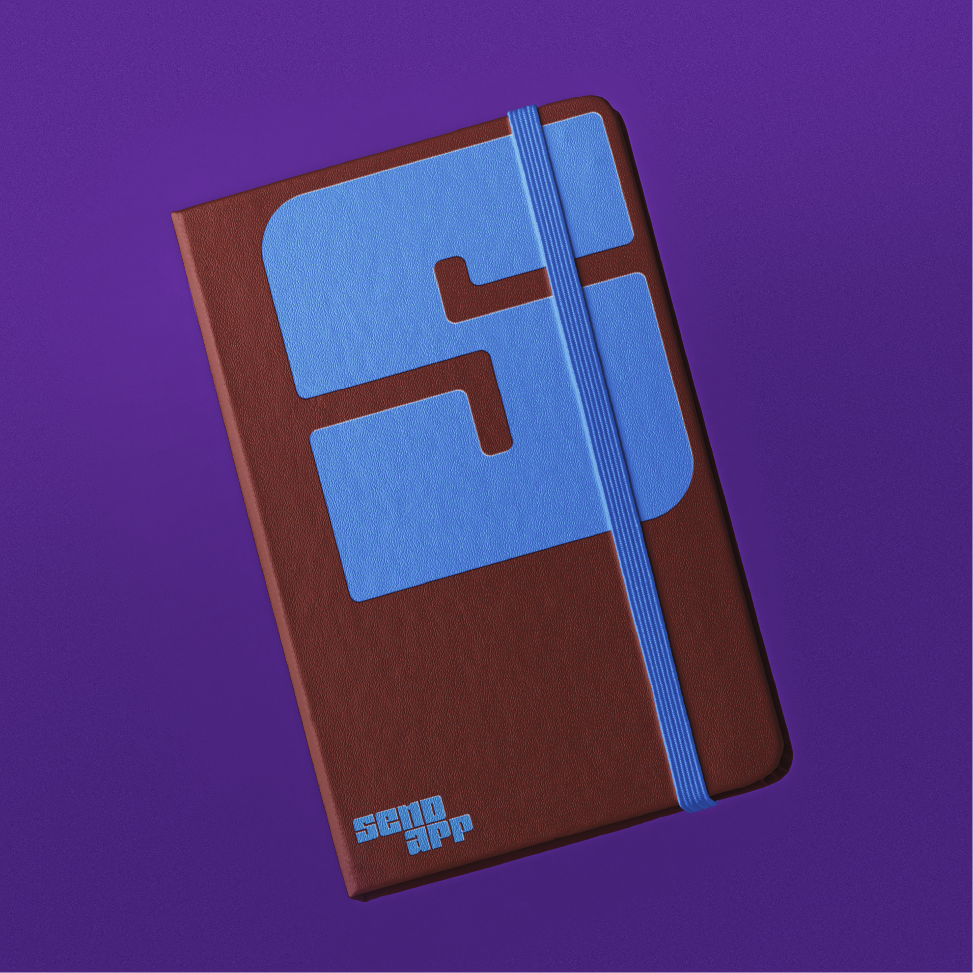
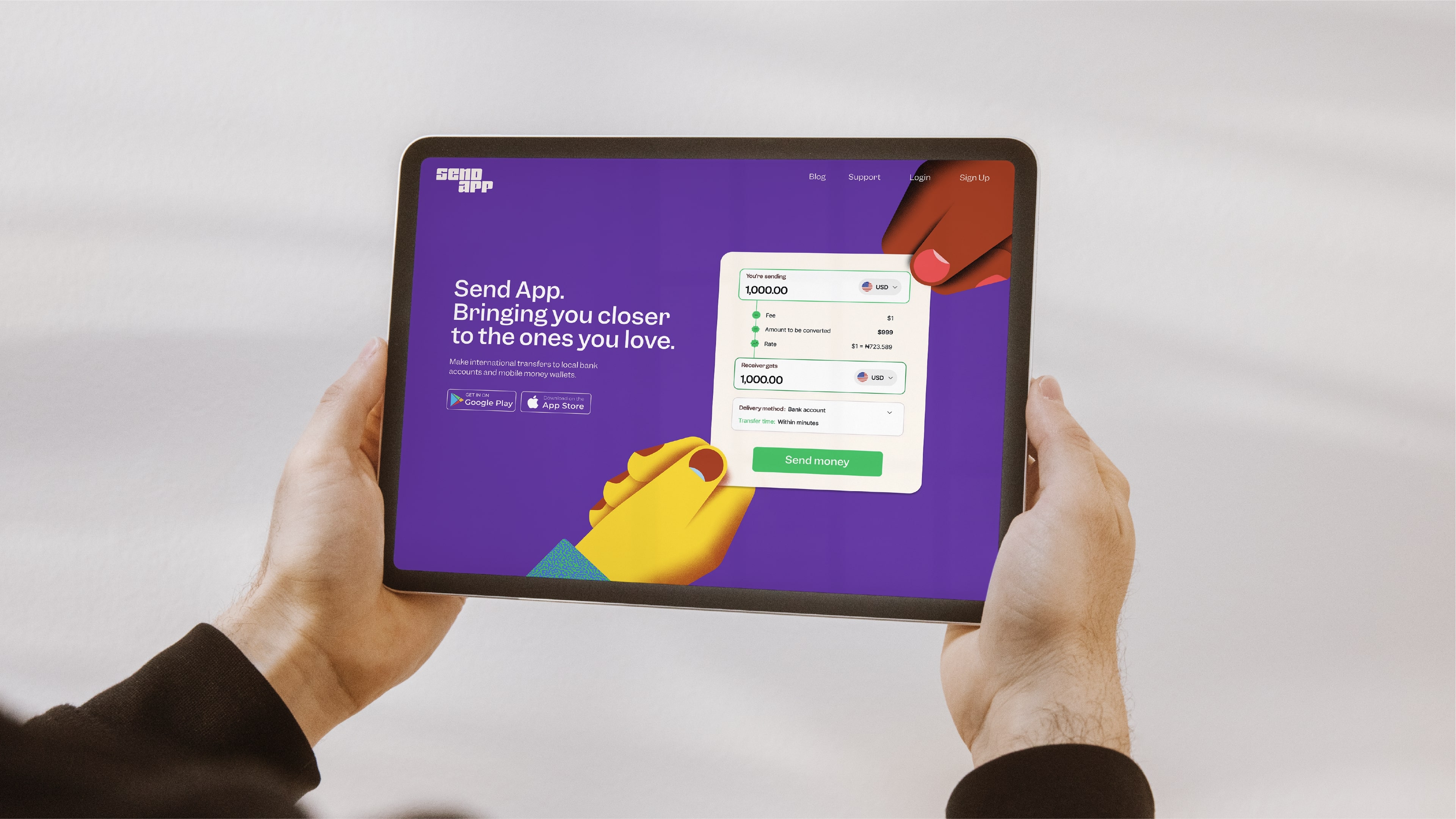
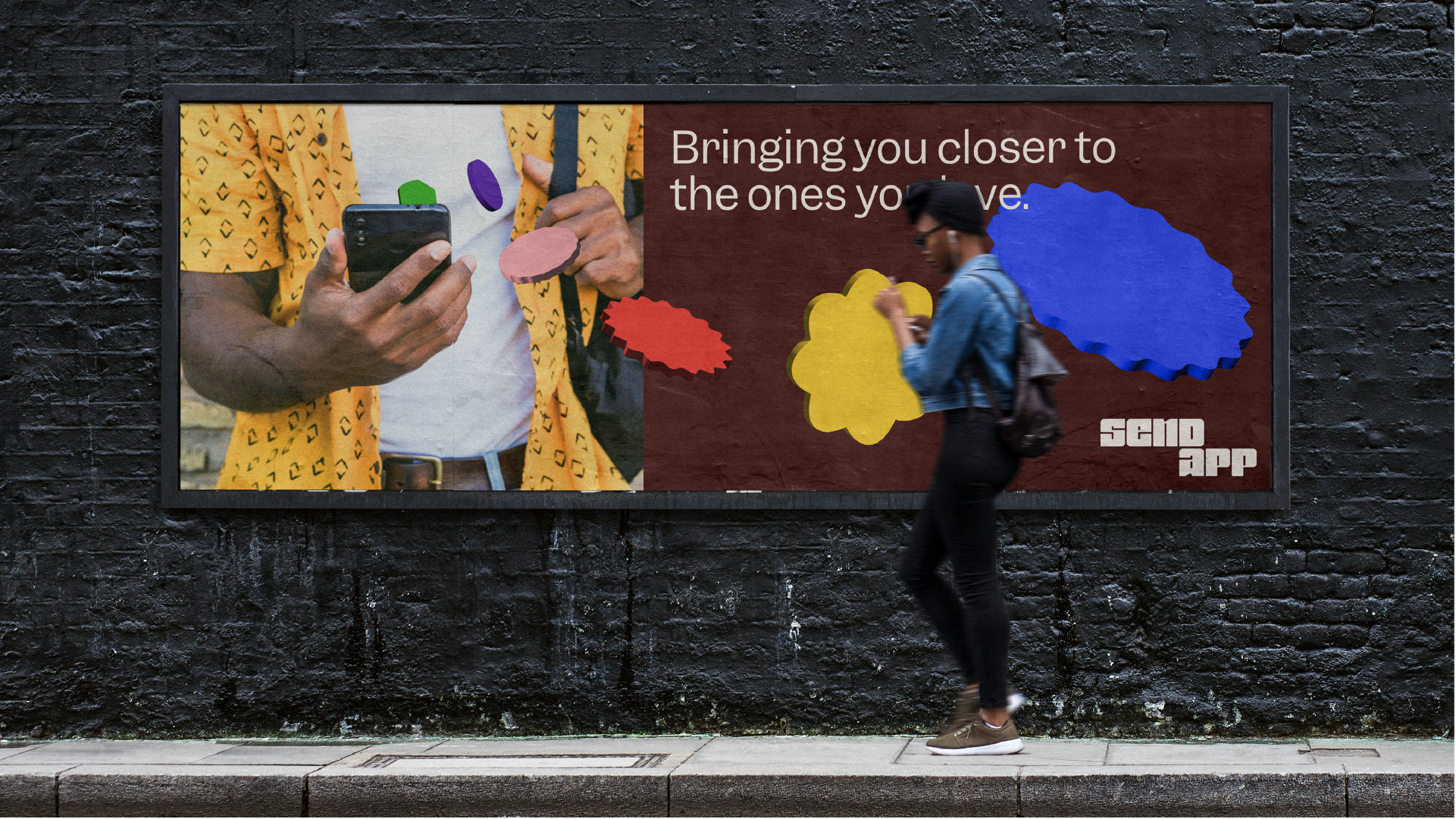
Character on all touch points
With a living brand comes a holistic toolbox. From the biggest billboard to the tiniest button, users will always recognise and experience the brand they love. And while this doesn’t happen overnight, we equipped Send App with the tools to be able to walk the talk on each and every touchpoint of the brand.
Sometimes, looks aren’t enough to convey a strong sense of security. Especially in the world of banking. We deep dived our way into sonic branding together with Sound Designer Senne van Marissing. Satisfying tones trigger unconscious emotions when interacting with the app.
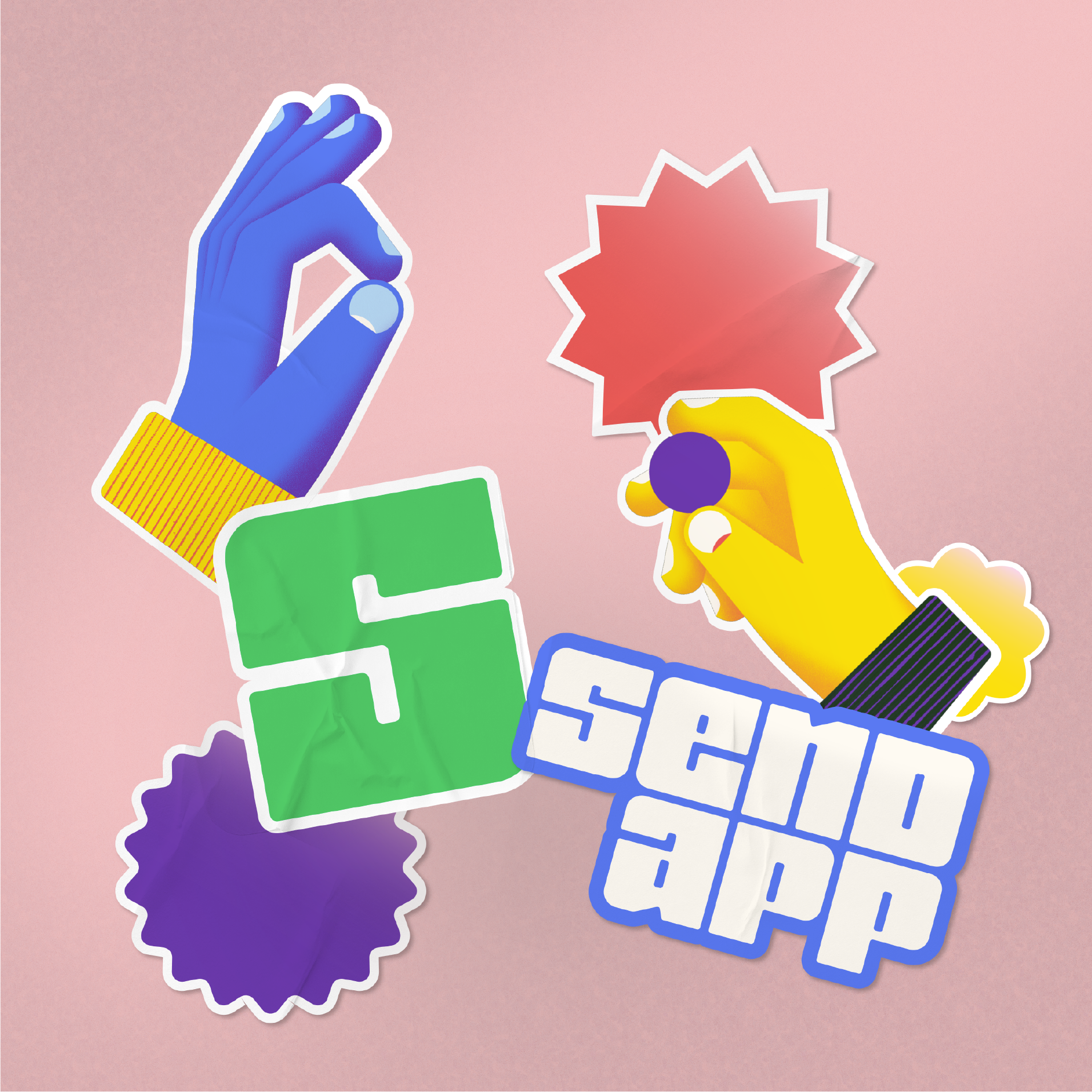
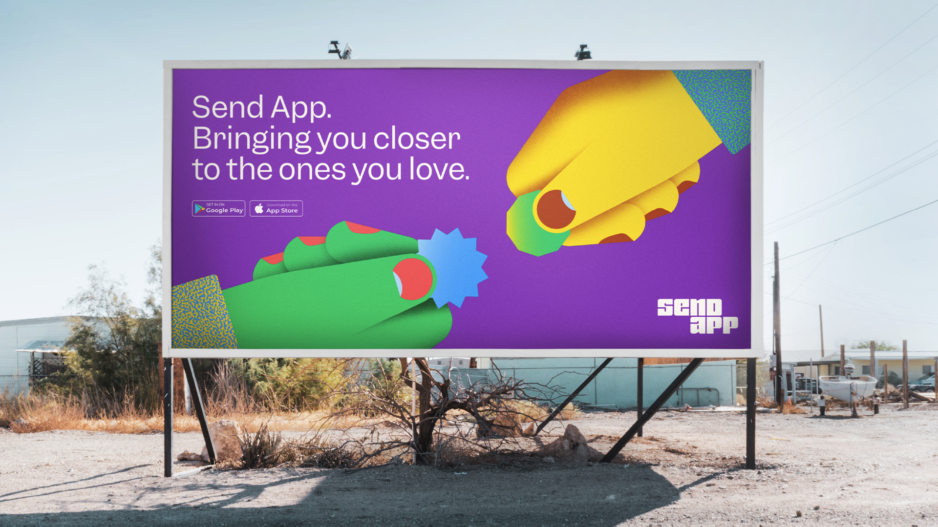
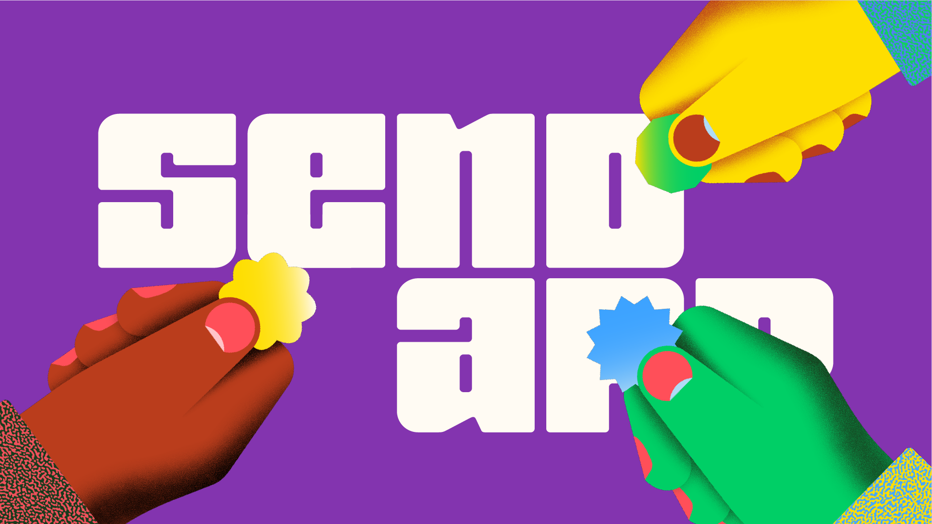
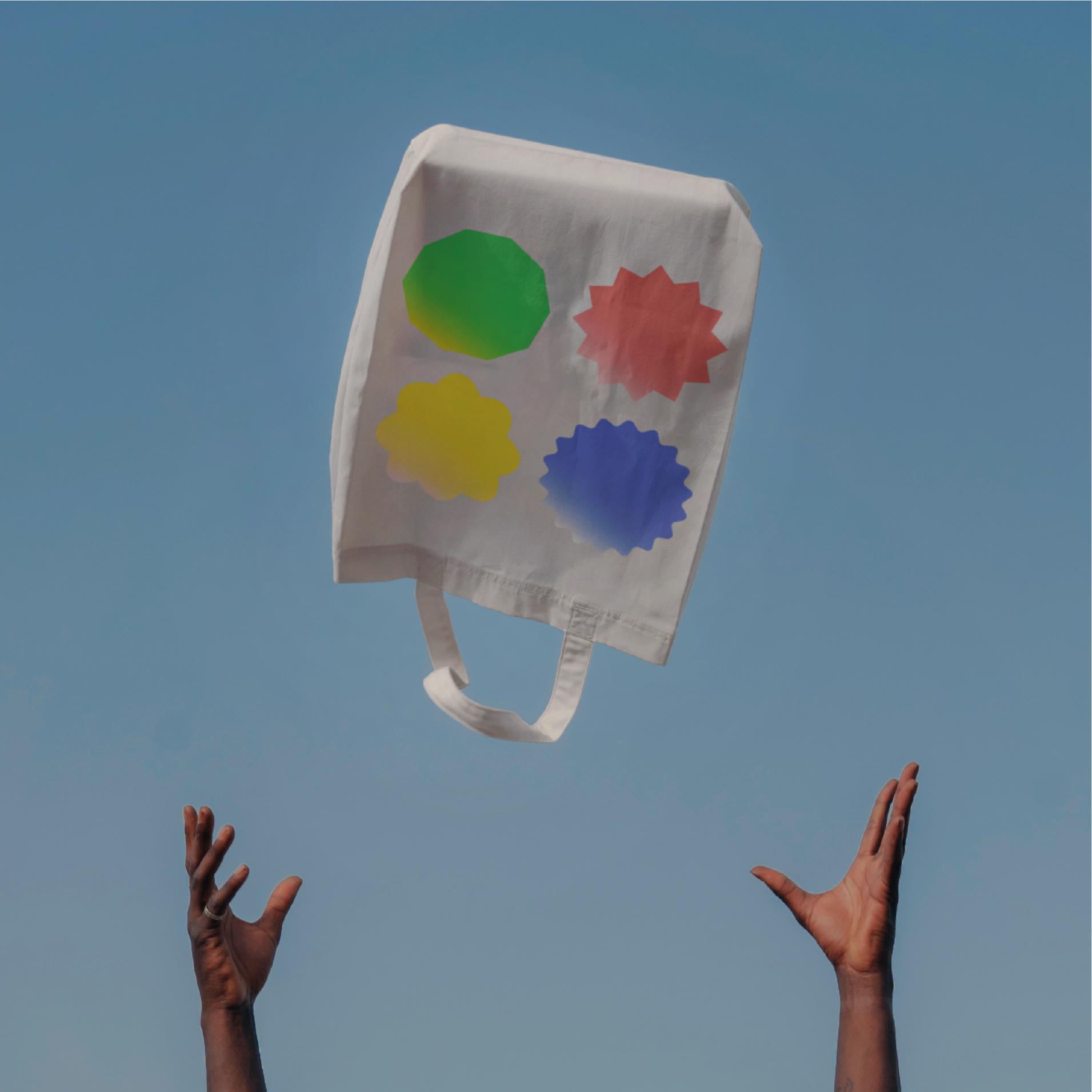
Championing true connection
To capture the human side of money transferring, we worked together with illustrator Andrea Manzati. Moments of true connection come to life in hands and coins while putting an emphasis on our world’s diversity. When in motion, the coin shapes change as they’re being handed over to your loved one — highlighting the playful and unique energy that flows between sender and receiver.
Functional transactions are reflected in photography. Warm tones and analogue vibes aren’t shying away from the bold brand Send App has become.

Nermin Camo, Senior Brand Strategist at Verve
“The way the shape and color of the illustrations transform shows that it’s not about the ka-ching, but about the message behind it — no matter the distance.”